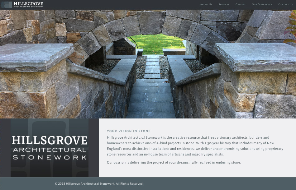
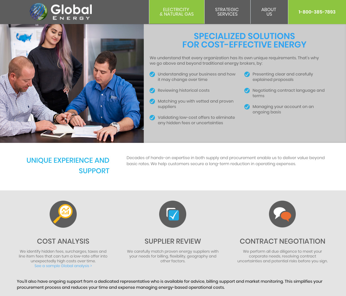
A New Hampshire stonemason and a New York energy consultant move into cozy new homes.
Online & Social Media
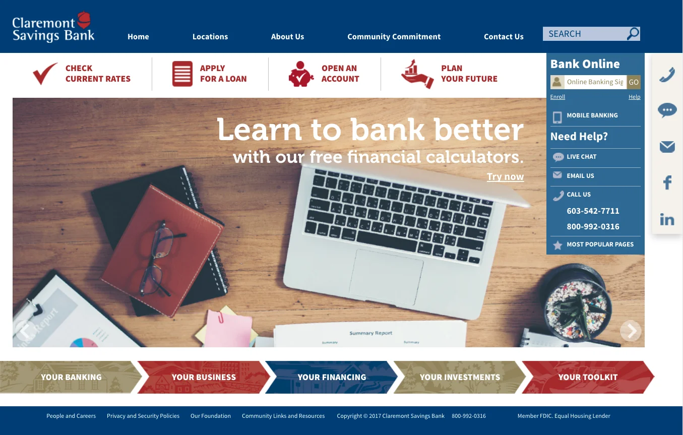
For CSB's responsive design website, I planned a 6-level content architecture that satisfied the bank's need for online revenue -- and customers' need for easy navigation on their terms.
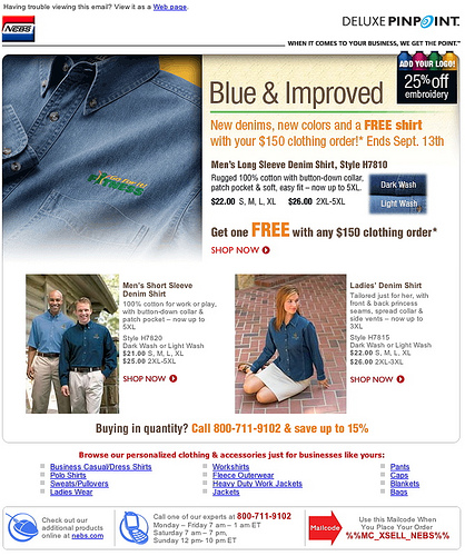
I always liked this headline for its neat solution to my manager's briefing: "It's really the same denim, only from a better vendor."

Quick, eye-catching ways to signal offers and calls to action is essential in any medium -- whether it's an email, a print circular or a store display.
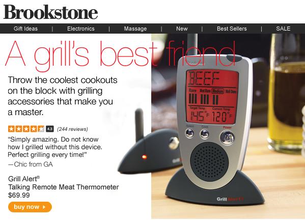
Even fun products at Brookstone had a lot of solid marketing behind them. Customer ratings and testimonial quotes are excellent tactics to drive click-through rates.
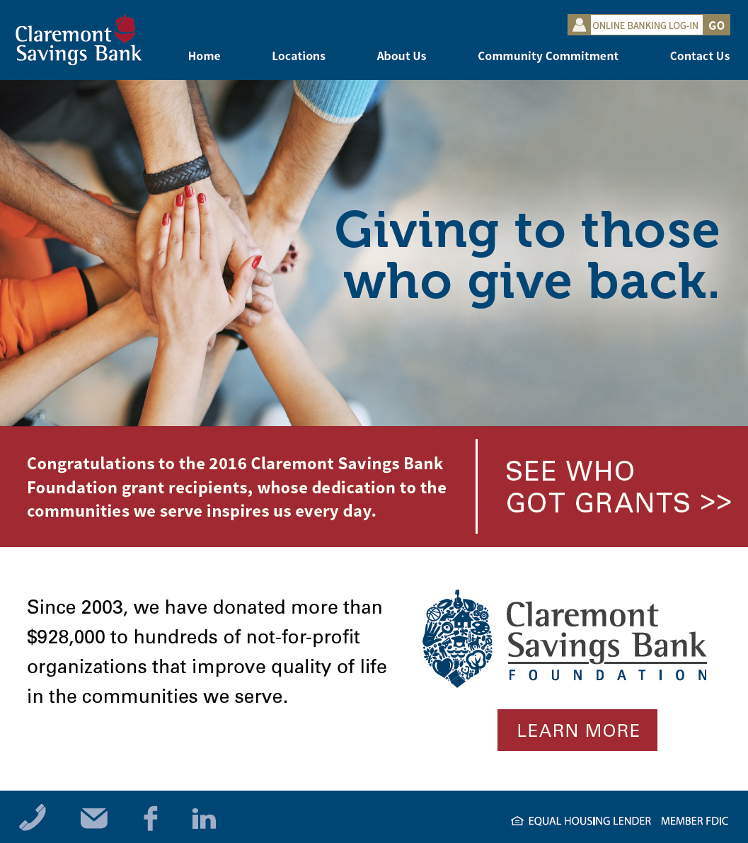
Announcing your own philanthropy is a delicate job. This email saluted winners of local nonprofit grants before promoting the bank's history of community stewardship.

This email was a launch twofer -- promoting not only a new treatment methodology for people with disabilities, but a new training firm for social services caregivers.

Everyone gets an electric bill, so we used prominent offer tags and clear, savings-oriented headlines for a "highest common denominator" approach that fit every demographic.

Snarled legacy websites often required Deluxe emails to serve as segmented mini-sites. I planned this "tatami mat" format to handle education, products, promos and multiple calls to action.
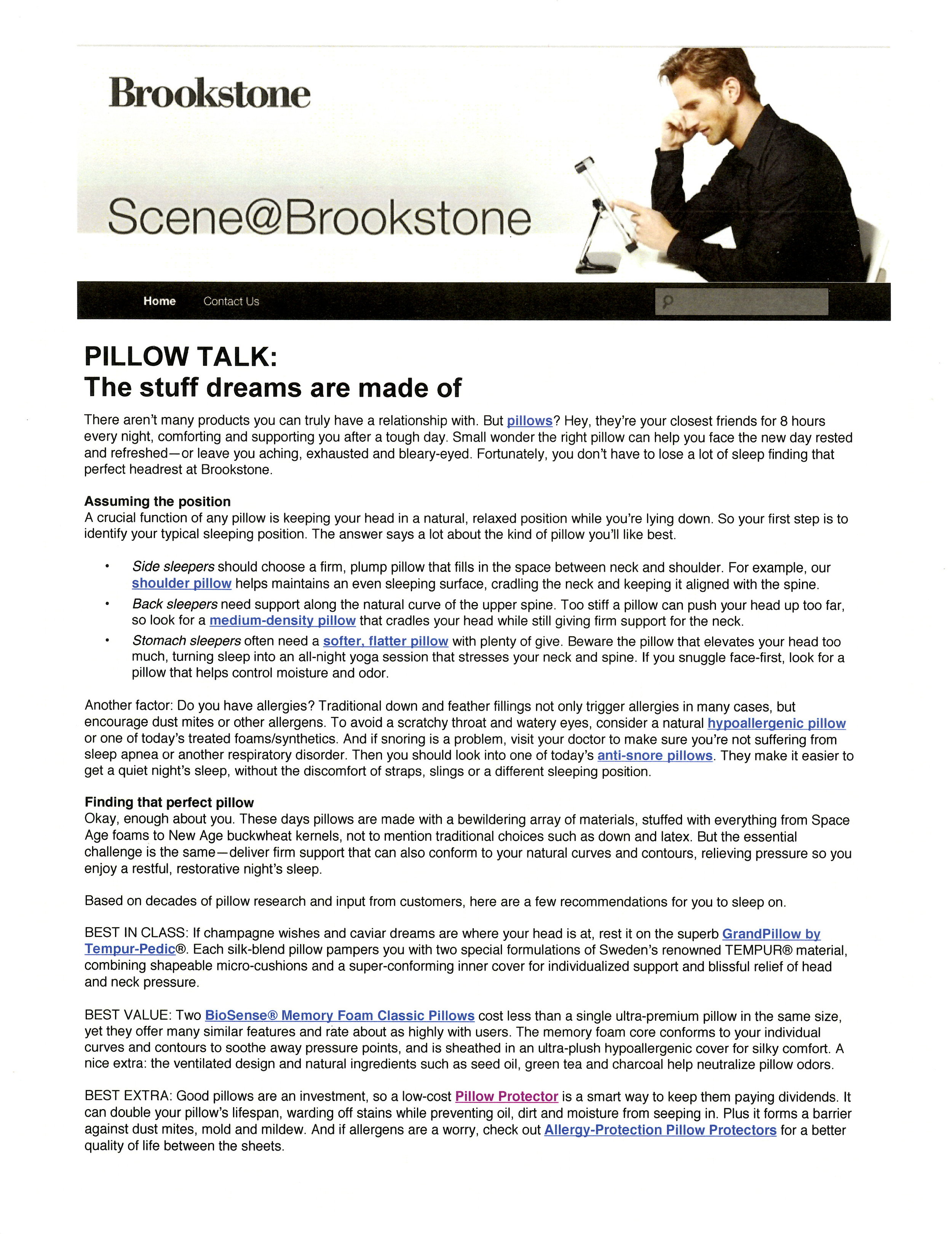
From an SEO standpoint, writing about pillows means getting in keywords. From a writing standpoint, it's making those keywords seem like bliss to someone desperate for a good night's sleep.


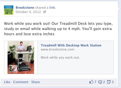
Even a cool new product can tax the patience of social media users if you're slow to the point. In 140 characters I got in a headline, a feature and two benefits.
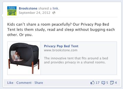
Social media isn't so different from the small-space print ads that Claude Hopkins wrote 100 years ago. Find a pain point, a need or a question ... then solve it in a way that serves the reader.

Facebook/Twitter posts like this are used during holiday periods, easily rebranded for sister utilities in Delaware and New Jersey.
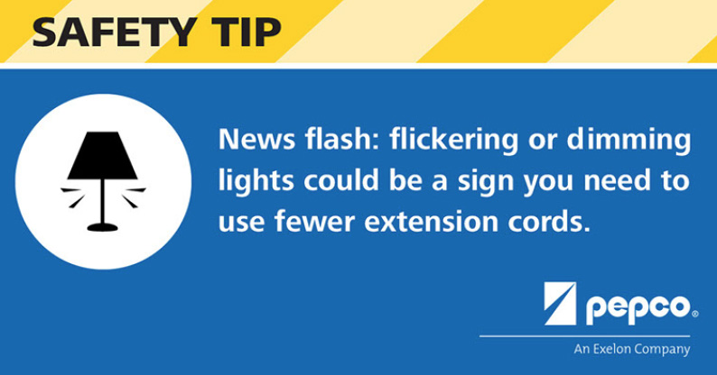
I researched dozens of electrical safety tips for this Mid-Atlantic utility, writing Facebook/Twitter posts they could use generically or during crisis periods such as storms and outages.
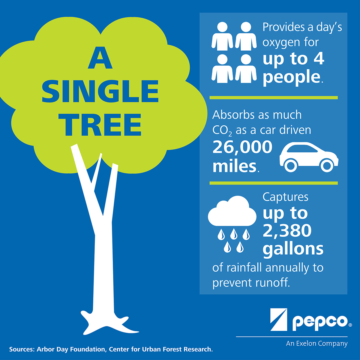
This infographic for an electric utility helped consumers feel good about a campaign that gave away shade trees to reduce summer cooling demands.

Upgrading to a responsive design for mobile devices gave me the opportunity to improve Claremont Savings Bank's online experience. See case story here.
A slideshow with details on some of my online and email writing, plus an article with useful responsive design tips.
