PROJECT CLOSEUP: IQ/Insurance Quarterly
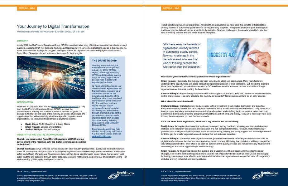
ADVERTORIAL PROJECTS ARE A COPYWRITER'S DECATHLON. Can you do research? Digest complex issues and edit them to fit marketing objectives? Or do you just hold your nose and flow in whatever the client gives you? Here’s a newsletter I did on behalf of Mastors & Servant, a Rhode Island insurance broker specializing in risk management.
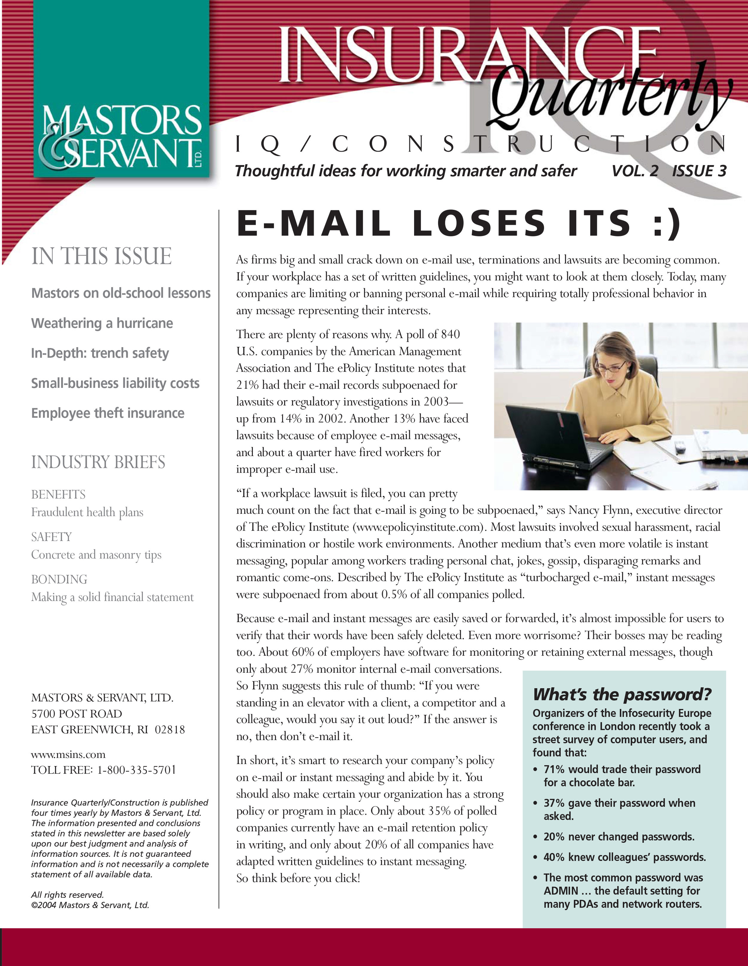
IQ helped Mastors & Servant position itself as a risk management partner rather than an insurance agency.
The construction edition of Insurance Quarterly (IQ), gave contractors “thoughtful ideas for working smarter and safer.” For general business editions, we changed red elements to green and substituted sidebar content that applied to anyone. The design was by my colleague Stephen Smith.
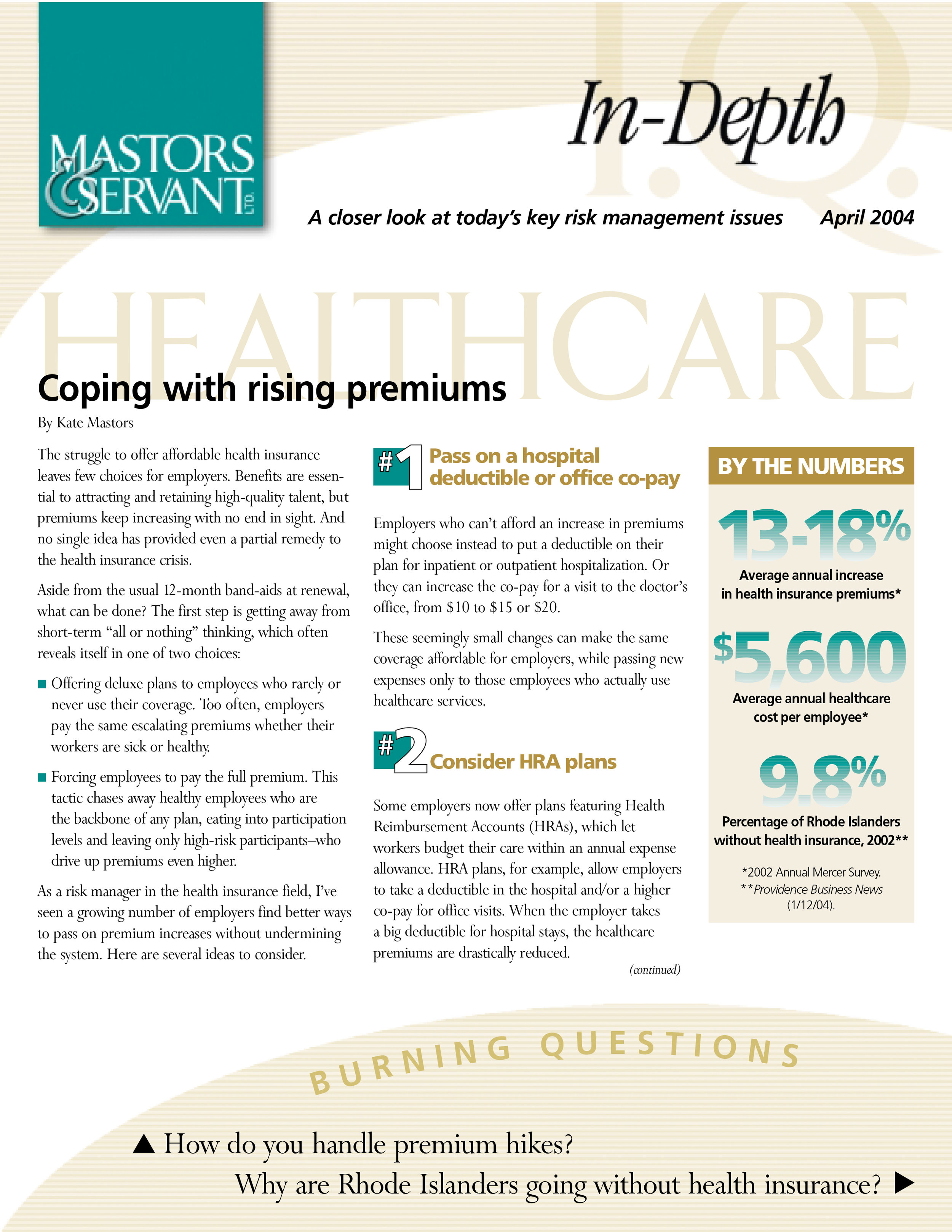
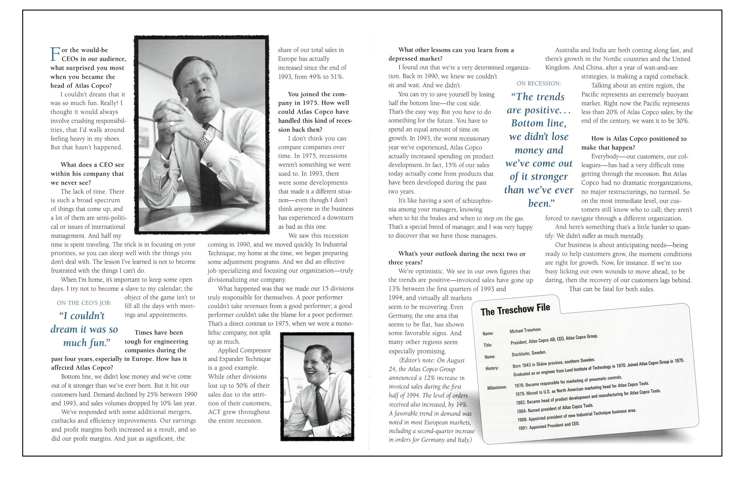
Later the client asked for some longer articles as well, so we created a single sheet insert called IQ/In-Depth. Here's an example. I've always been a fan of fact-driven sidebars to counterbalance long copy.
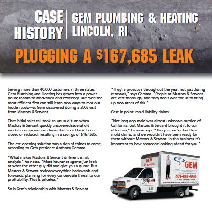
This newsletter proved to be a very practical sales tool for Mastors & Servant during its two-year, 11-issue run. Salespeople used the articles to introduce customers and prospects to insurance topics of all kinds, and electronic versions in PDF enhanced the agency’s image as a thought leader. It’s the kind of unsung, hard-working content that I am unfashionably proud of. | DC |

